Exploring the Simpson’s Paradox Within the Penguin Dataset
And simultaneously demonstrating the capabilities of Quarto.
This document is a short analysis of the Penguin Dataset. It explores the relationship between bill length and bill depth and show how important it is to consider group effects.
Author
Affiliation
Yan Holtz
Independant 😀
Published
February 26, 2024
Keywords
Quarto, Paradox, Data Analysis
A few consideration about this doc
This Quarto document serves as a practical illustration of the concepts covered in the productive workflow online course. It’s designed primarily for educational purposes, so the focus is on demonstrating Quarto techniques rather than on the rigor of its scientific content.
1 Introduction
This document offers a straightforward analysis of the well-known penguin dataset. It is designed to complement the Productive R Workflow online course.
Now, let’s make some descriptive analysis, including summary statistics and graphs.
What’s striking is the slightly negative relationship between bill length and bill depth. One could definitely expect the opposite.
Code
p <- data %>%ggplot(aes(x = bill_length_mm, y = bill_depth_mm) ) +geom_point(color="#69b3a2") +labs(x ="Bill Length (mm)",y ="Bill Depth (mm)",title =paste("Surprising relationship?") ) +theme_ipsum()ggplotly(p)
Relationship between bill length and bill depth. All data points included.
It is also interesting to note that bill length a and bill depth are quite different from one specie to another. The average of a variable can be computed as follow:
For instance, the average bill length for the specie Adelie is 38.81.
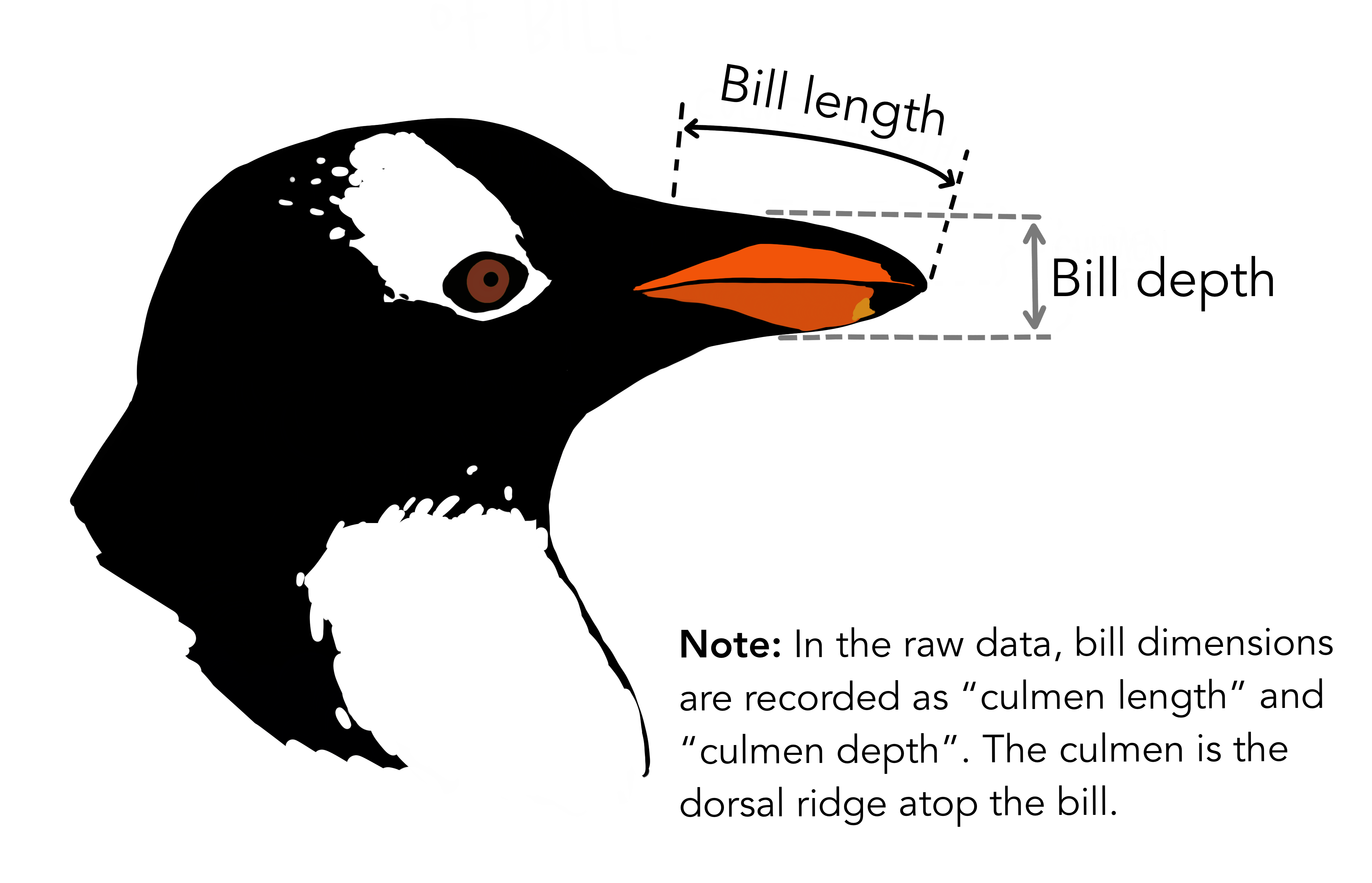
Now, let’s check the relationship between bill depth and bill length for the specie Adelie on the island Torgersen:
Code
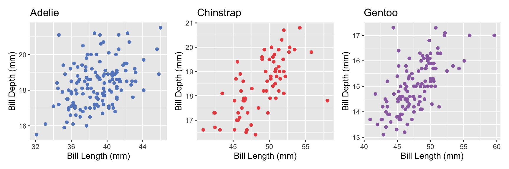
# Use the function in functions.Rp1 <-create_scatterplot(data, "Adelie", "#6689c6")p2 <-create_scatterplot(data, "Chinstrap", "#e85252")p3 <-create_scatterplot(data, "Gentoo", "#9a6fb0")p1 + p2 + p3
There is actually a positive correlation when split by species.